COLOUR USAGE
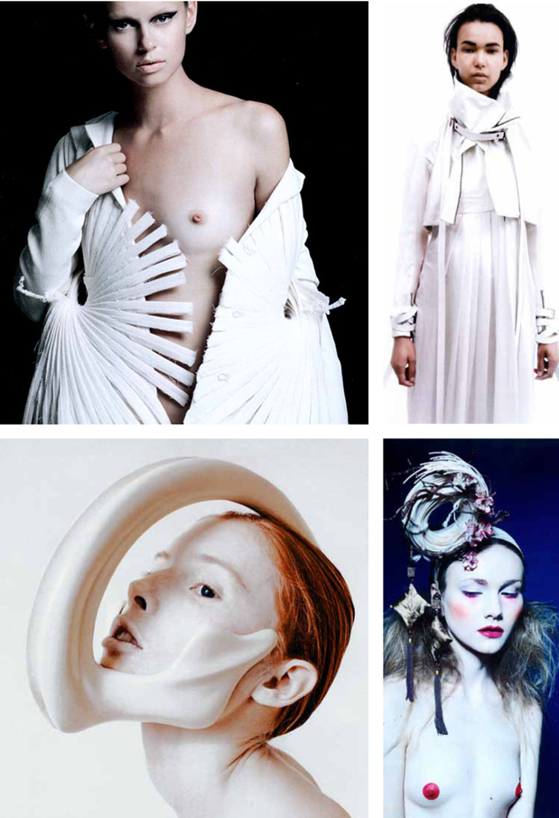
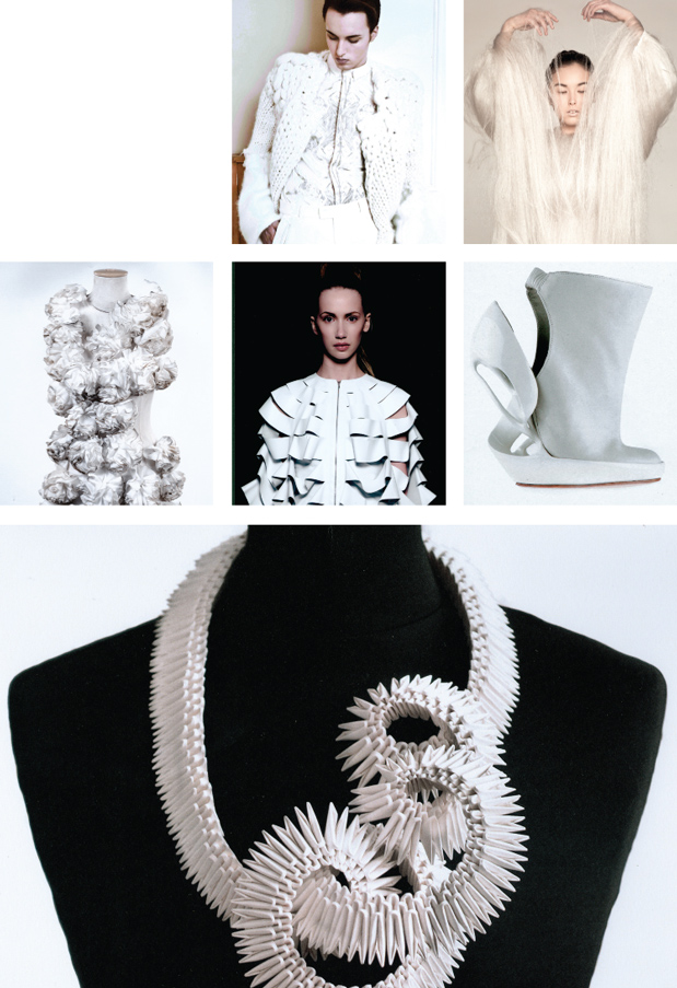
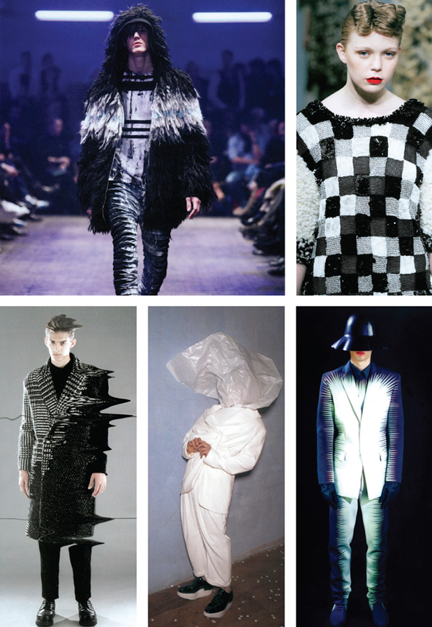
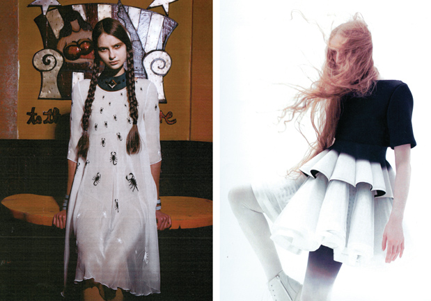
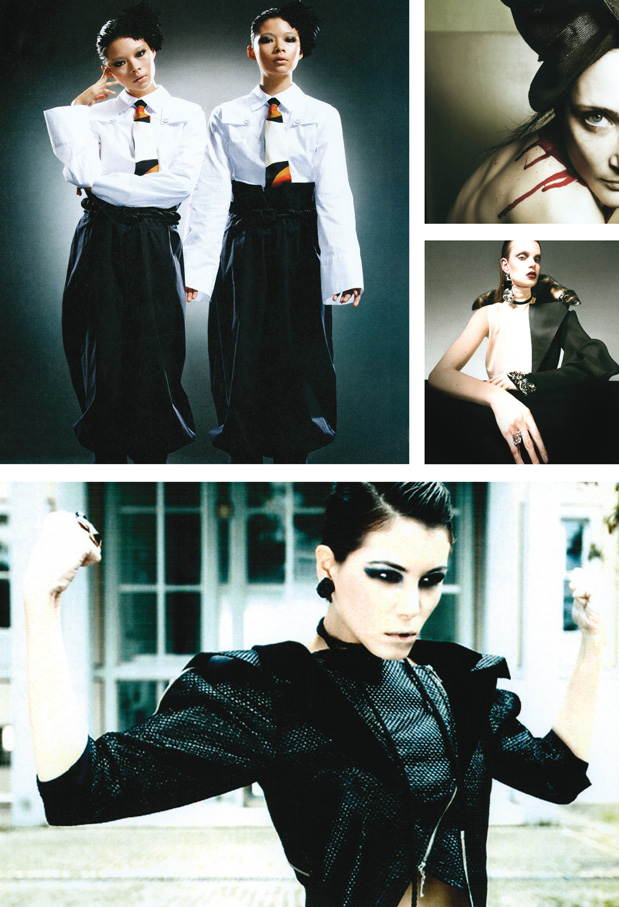
The standout trend when examining the portfolios was the use of colour, especially the white/black contrast. Last year we had already underlined the importance of the use of white in the projects submitted, yet never seen with such predominance. This time the novelty lies in the fact that white is used in contrast with black. Is it just a coincidence that the theme of ITS 2012 is precisely “Good & Evil”, represented by a double image, one featuring a black background, the other a white background? White, the sum of all colours in the electromagnetic spectrum opposed to black, the total absence of colour. But most of all, black and white as the main metaphor of good and evil clashing, a representation that loses itself in the dawn of time, expressed through the Ying and the Yang; the black and the white knight, the chessboard; day, the ultimate symbol of life, and night, the metaphor of death, of the absence of light that generates life. What really counts is that such opposition entails that white is not only used as a colour but becomes a true concept in itself. Stimulating a standpoint, a choice between two different sides and turning into a message which conveys its own story. The opposition between black and white conceals the more widespread and transversal concept of the contestants’ projects we may sum up with one question: “Whose side are you on?” The current economic, cultural and ethical status quo tells us of black and white, of good and evil. The end of the Mayan’s calendar on 21st December becomes in this specific case an excuse for a “pitstop” for man’s priorities, called to choose between the selfish ethics of a materialistic dimension linked to money and the wish to live all together, with, and for, the others; and between those who betray and crush others focusing on one’s own concerns, and those who work for the common good, sharing a mission for the future of humanity as a whole. We probably perceive that we are using poison to cure the disease caused by that same poison. Through their projects, young contestants are shouting out loud their need for change, for renewal, for rebirth.
White
Black and white
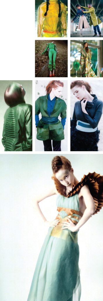
Besides the two extremes of black and white, the only other color we have detected were the nuances ranging from green to blue, including aquamarine, celadon green, green tea, turquoise, pale turquoise, robin egg blue, forest green, pale green, mint green… We could really list all the variations. Still, the use of colour proved to be a common trait shared by all submitted projects, to the detriment of prints. These were very few, almost non-existent.
Green and blue
PHOENIX AND BIRDS
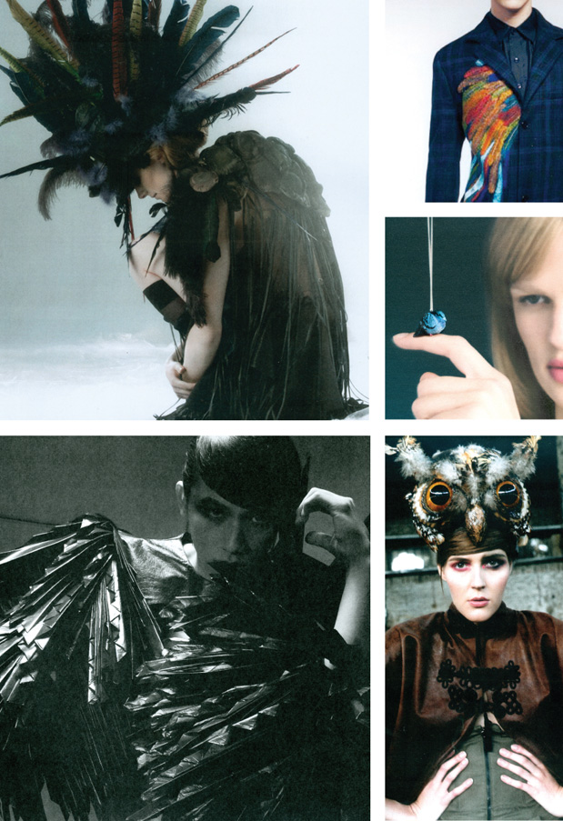
The symbol of the bird that is reborn anew from its ashes is also making a comeback as the metaphor of a spiritual resurgence as a reaction to a strong desire for change. But also the use of bird imagery, in general, makes a comeback with various symbolic references. After the storm, Noah’s ark received the message of a new Earth cleansed from impurities from a dove holding olive leaves in its beak, becoming the ultimate symbol of peace. The idea of flight as the escape from adversities, as the rise towards a higher state of awareness of the human being. Birds have been used in all possible modalities: stylised – often using only the wings, which bring us back to the metaphor of the flight- used as headgear, embroidered, incorporated into the few prints we have found or into jewelry designs.
STRONG WOMAN
From such necessity for rebirth symbolised by the Phoenix, emerges the representation of a strong woman who has now her role very clear in her mind. A human being that can and must express herself through the various roles and needs that being a woman entail: mother, creator, professional, wife, lover, confidant, guide… A strong and caring woman whose grief can only come out of her clothes’ seams… She is a woman who never forgets to be romantic. It’s as if the hope for rebirth passed through the role of women.
CONTRASTING ELEMENTS
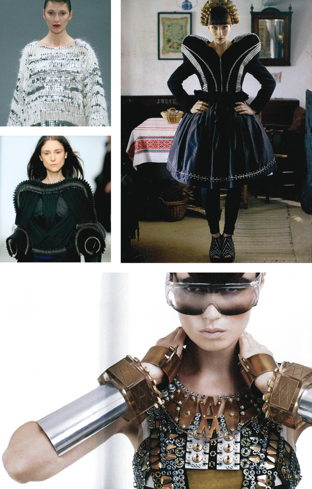
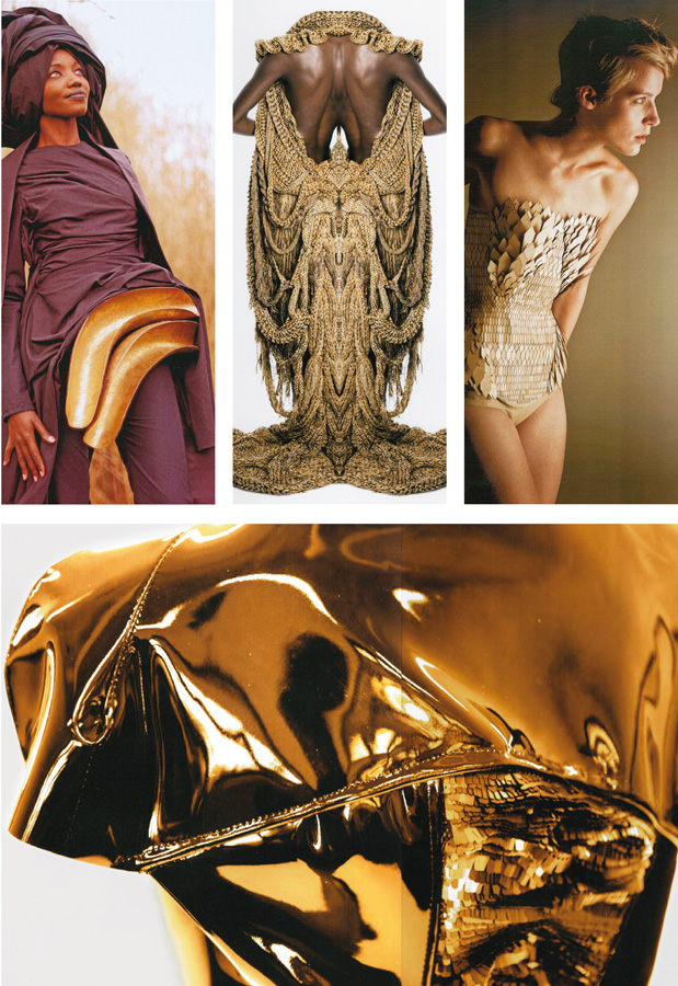
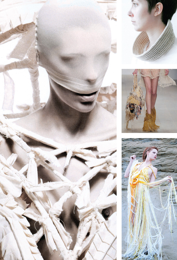
Romanticism and the opposition to romanticism brought about an extensive use of lace, of metallics – with a strong presence of gold- of rope and pearls. The presence of such elements has proved to be totally transversal and very strong in all three areas of ITS. Once again used in contrast, just like black and white, opposed in the message conveyed, but also loaded with their individual symbolic values. Like gold, that is the metaphor of the sun and therefore of light as opposed to darkness, the symbol of divine principles and of clarity of vision as well as longevity. Or like rope, a cosmic symbol which recurs in Tibetan mythology before the rise of Buddhism where a rope connected the Earth to the sky favouring the descent of the gods among men (the metaphor of wisdom that descends over man) until when, with the “fall” of man and the coming of death, the rope was cut off. Or pearls, the essential symbol of creative femininity, identified with the foetus, which provide her with reproductive properties, of change and regeneration, which brings back the image of a strong woman.
Metal
Gold
Lace
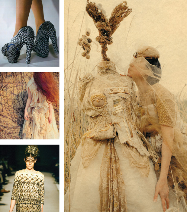
Rope
3D ELEMENTS
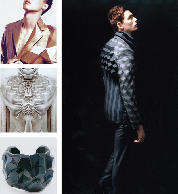
We have observed numerous 3D elements, also in this case used transversally, almost as to indicate that the two dimensions are not any longer enough.
VOLUMES BELOW
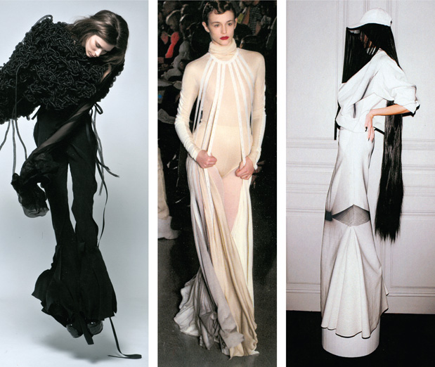
Last year we observed a kind of search for perfection through the dominating use of symmetry and geometric shapes, with linear motifs, polygons, triangles and shapes recalling the pure lines of a diamond. This year we have not seen any kind of limitation: from volume on upper/lower parts of the garments, from polygonal shapes to floaty and curvy silhouettes, to the total lack of volume. With one exception: a focus on volume under the knee.
MENTAL ILLNESS
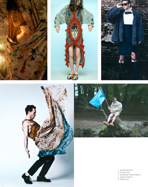
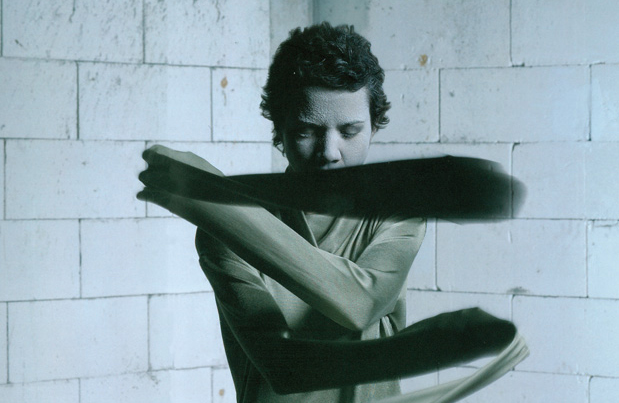
A trait we had already started to observe last year in the themes chosen by the designers was the representation of mental illness, always featured in times of crisis. The lack of identity, the “misplacement” caused by the search for a new identity, or by the inability to relate with the direction taken by the surrounding world. The seeming appearance of a total crisis, of a renewal that would probably entail, in any case, a huge shock for the world, is also summed up by a mental crisis that in this case becomes a metaphor.
COVERED FACES AND RELIGIOUS ELEMENTS
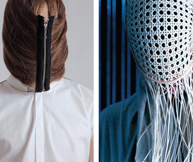
The religious element – which we had observed last year with the aesthetics inspired by nuns’ habits – is also making a comeback, this time with special attention to Muslim women’s headresses. A peculiar choice is also the use in menswear of women’s garments from the Islamic tradition. The references to traditional apparel are all-encompassing, from the Hijab, which covers the face and the hair, to the Hijab Niqab, to the Burqa and the more extreme Khimar, a cape that covers the woman from the head down. Covered faces are also making a comeback, a regular feature in the last years, yet this time bearing a peculiar religious meaning.
